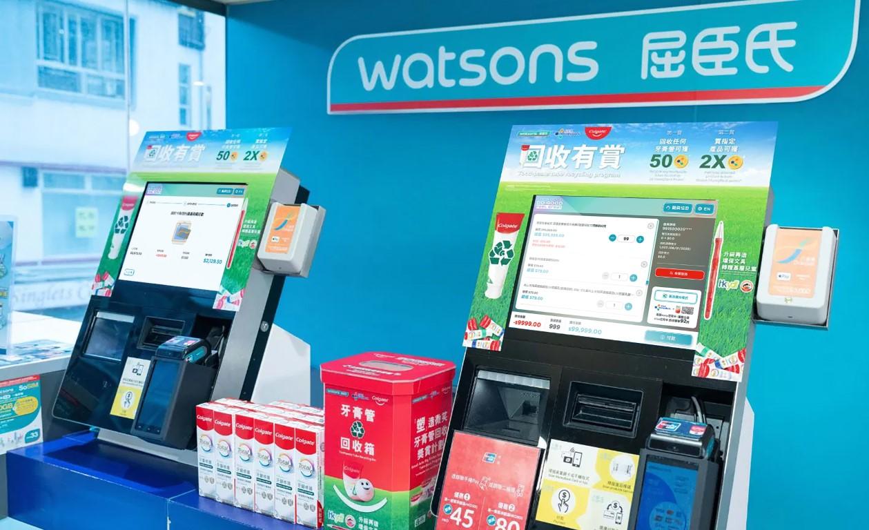
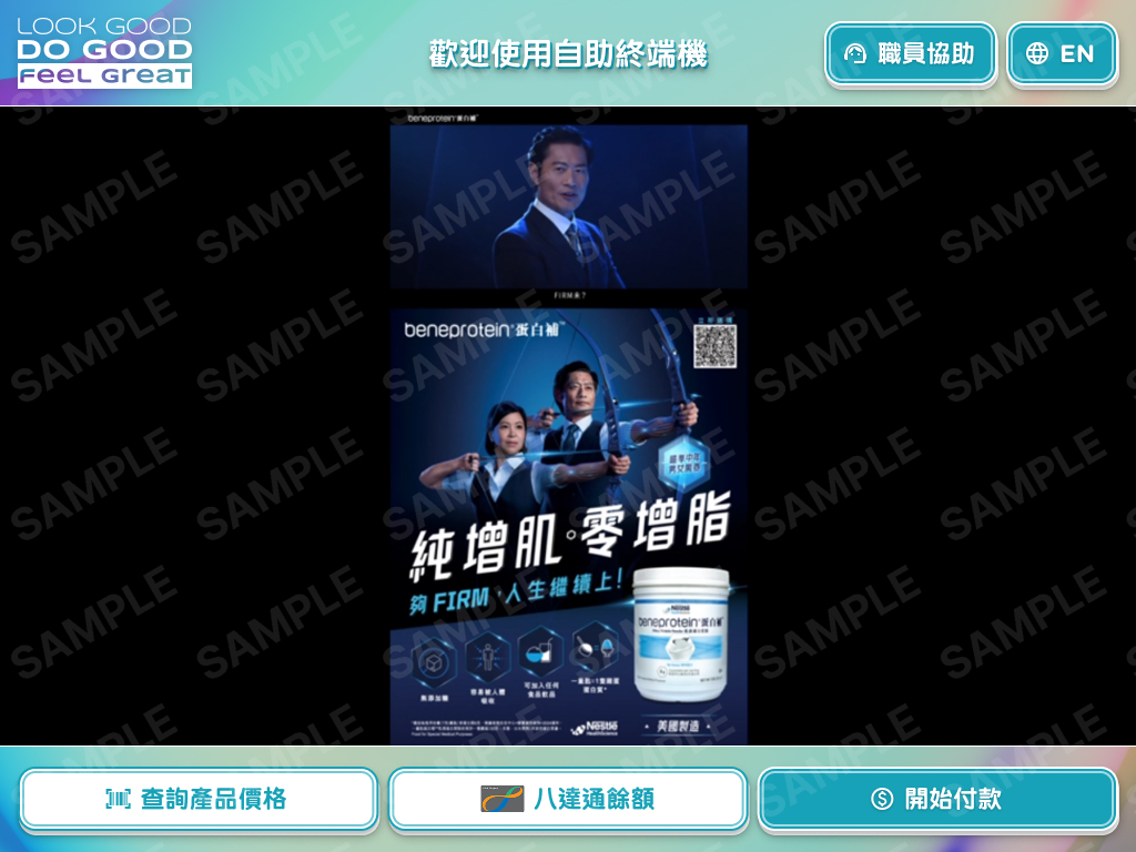
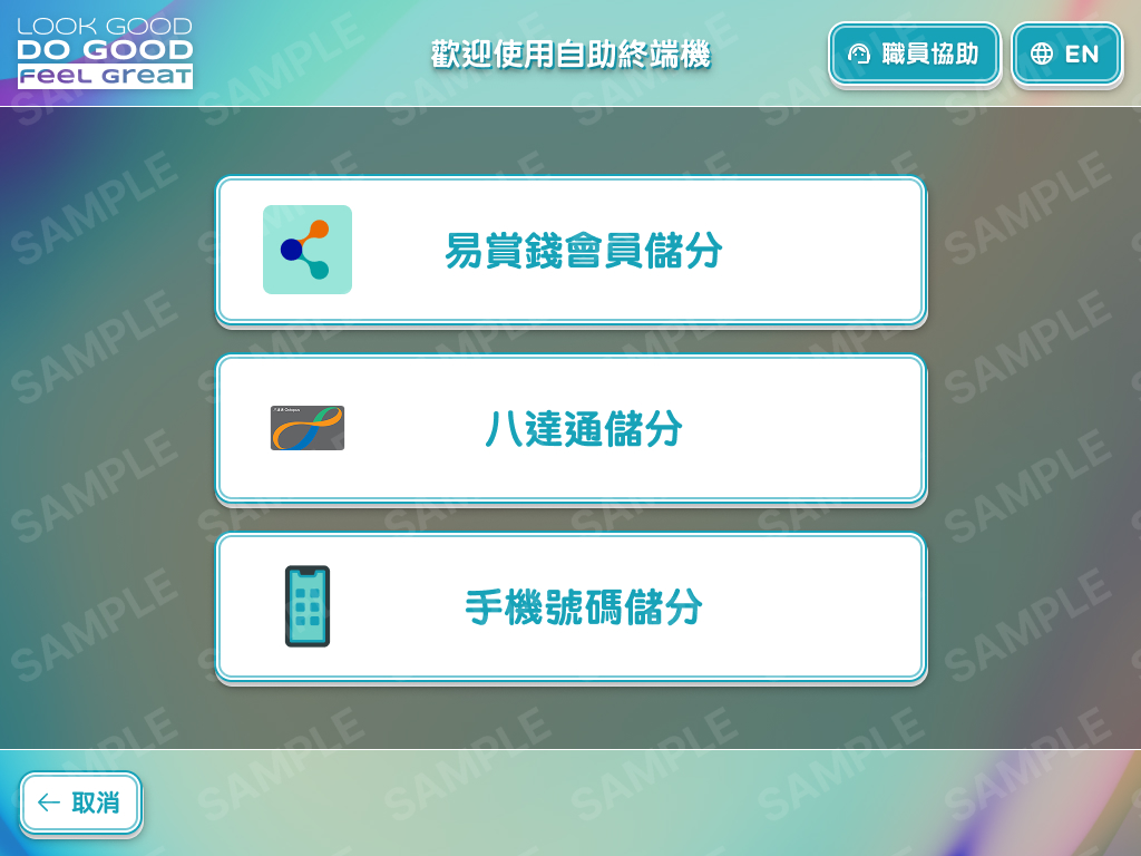
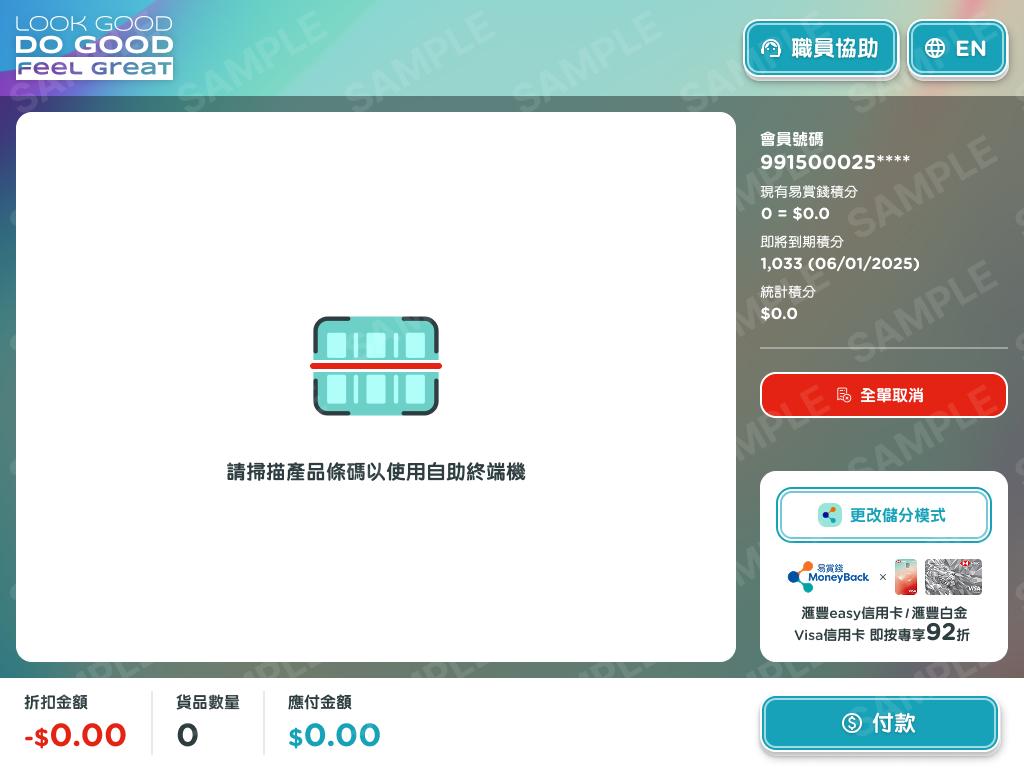
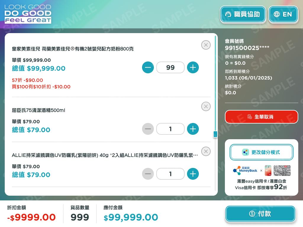
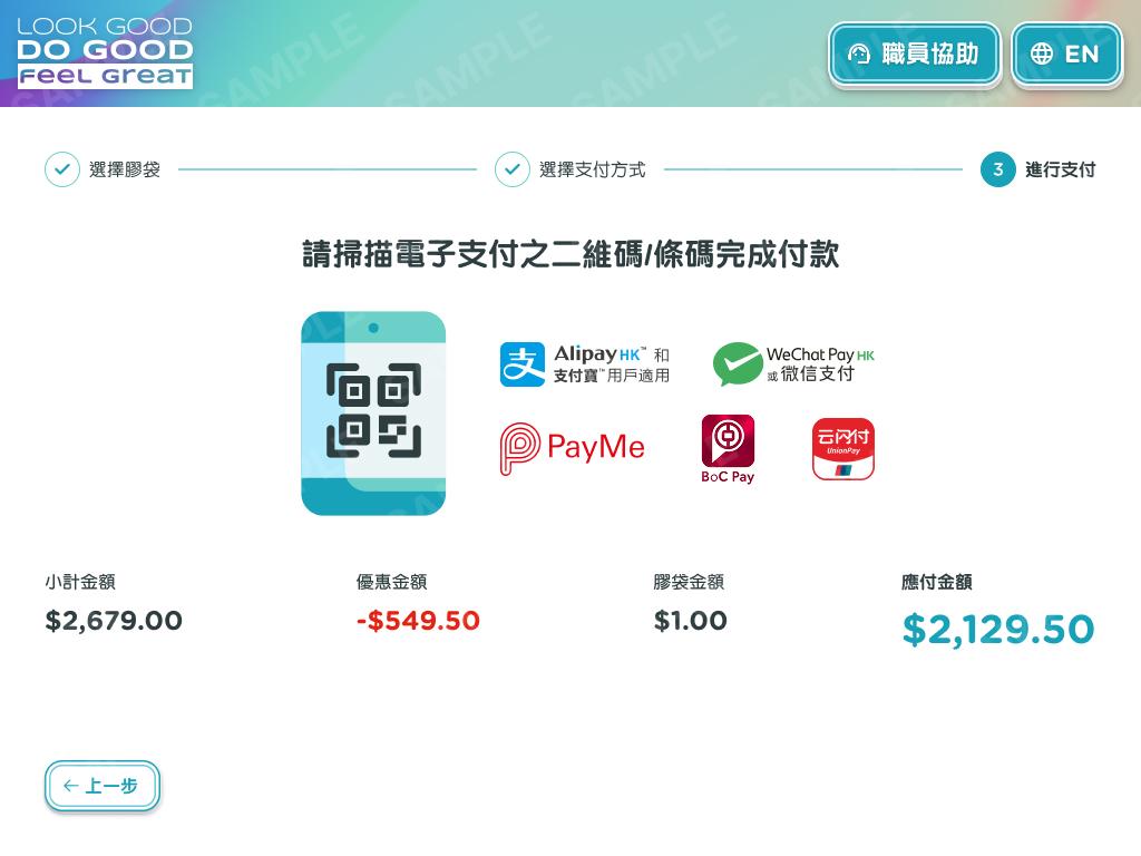
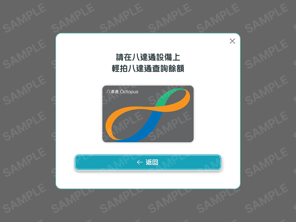
Redesign of Watsons’ existing in-store self-service kiosk system to improve usability, accessibility, and brand alignment across retail touchpoints. The project focused on simplifying complex interaction flows and creating a more intuitive, customer-friendly interface while maintaining operational efficiency in a high-traffic retail environment.
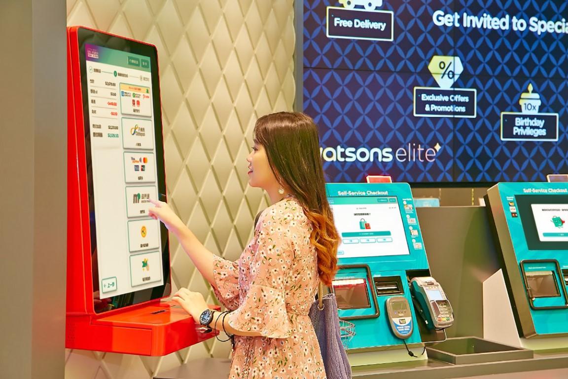
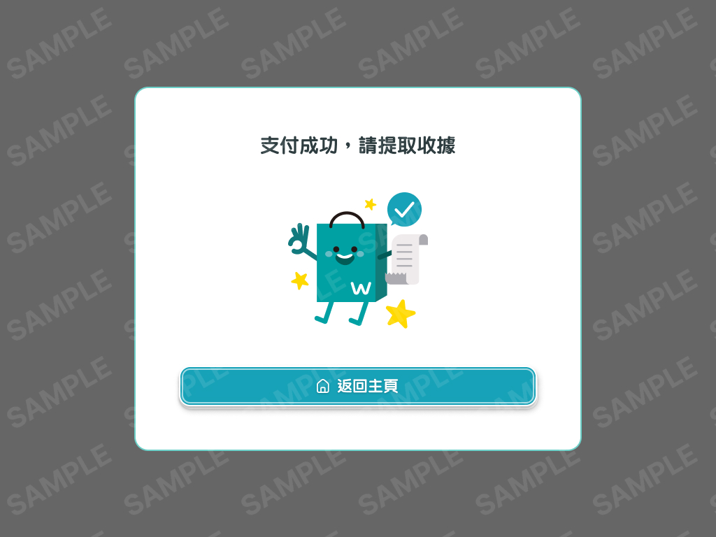
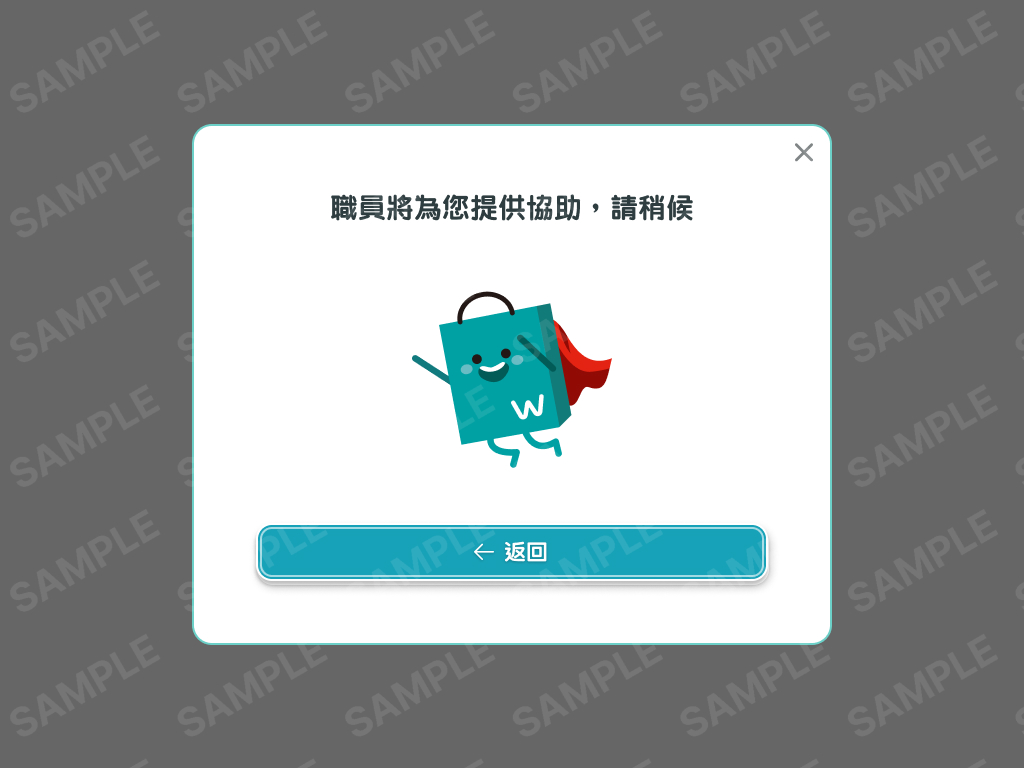
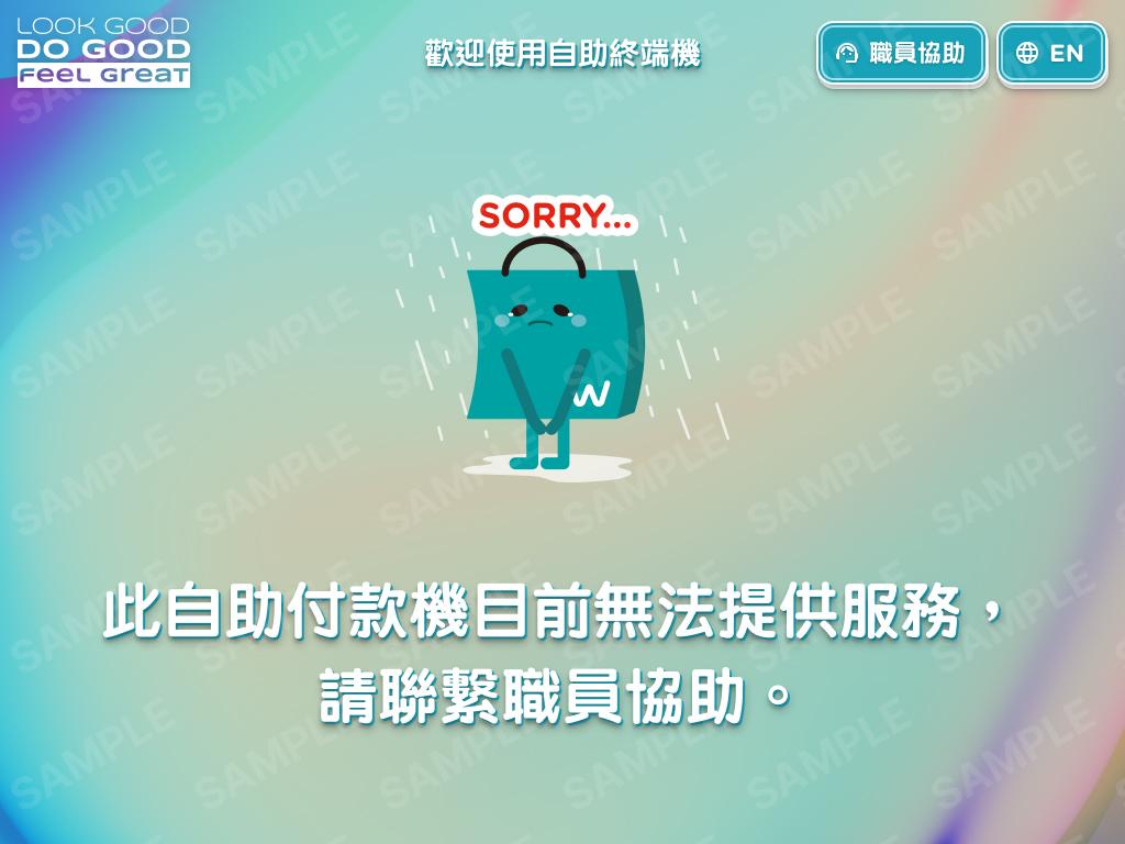
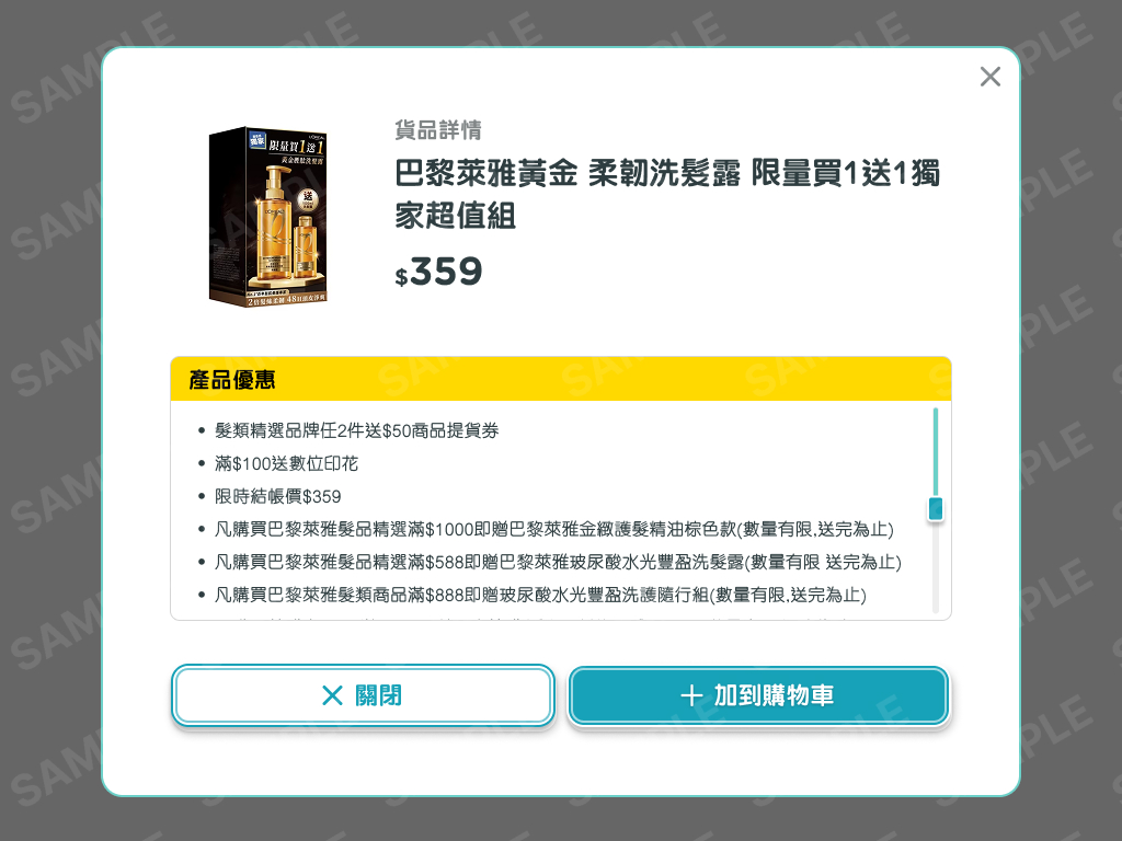
The kiosk UI was redesigned to better reflect Watsons’ branding guidelines, ensuring visual consistency with other digital and in-store experiences. Special attention was given to readability, touch-friendly interactions, and error prevention to support a wide range of users, including first-time and elderly customers.
In parallel, an internal admin dashboard was designed to provide store-level insights through a Store Usage & Hit Rate Overview system. The dashboard enabled headquarters and store managers to monitor kiosk usage frequency, interaction patterns, and performance trends, supporting data-driven optimization of in-store digital services.
Redesigned the existing self-service kiosk UI to improve usability, clarity, and interaction efficiency in a retail environment.
Simplified user flows and information hierarchy to create a more intuitive, human-centered kiosk experience.
Applied Watsons’ branding guidelines to ensure visual consistency across in-store digital touchpoints.
Designed an admin portal featuring Store Usage and Hit Rate Overview dashboards for performance monitoring and analysis.
Collaborated with stakeholders to align UX decisions with retail operations and business objectives.
Supported developers during implementation through design specifications and design QA to ensure accurate execution.